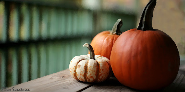
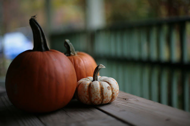
I hope you like this one as much as I do. One of the things I love about this Pumpkin Header is that I went out intentionally to get a photo for my header. Usually I'll just go back and find a picture that I think will look nice and work it in. Here is the original photo.
 I wanted to make sure the pumpkins were on one end of the photo so my title would sit nice, however the light was coming from the direction that would create a problem. But with Photoshop there really is no problem. I just flipped the photo. I took the picture with my 50mm lens at f/1.4 so that the background would be soft. I used my favorite filter in Photoshop, Dry Brush, to create the painted feel, and then brightened it up a bit with my plug-in filter Fractalius from Redfield. Then there was my beautiful blue Subaru in the background causing a little color headache, but not to worry. With a little time and effort I used the clone stamp tool to work out the background. I used the paint pail to fill in spots close to the pumpkin that were difficult to get with the clone stamp. and went back over with the clone stamp to blend it all in. A bit of a crop and copyright and WaLa!
 One of the things I love about this Pumpkin Header is that I went out intentionally to get a photo for my header. Usually I'll just go back and find a picture that I think will look nice and work it in. Here is the original photo.
 I wanted to make sure the pumpkins were on one end of the photo so my title would sit nice, however the light was coming from the direction that would create a problem. But with Photoshop there really is no problem. I just flipped the photo. I took the picture with my 50mm lens at f/1.4 so that the background would be soft. I used my favorite filter in Photoshop, Dry Brush, to create the painted feel, and then brightened it up a bit with my plug-in filter Fractalius from Redfield. Then there was my beautiful blue Subaru in the background causing a little color headache, but not to worry. With a little time and effort I used the clone stamp tool to work out the background. I used the paint pail to fill in spots close to the pumpkin that were difficult to get with the clone stamp. and went back over with the clone stamp to blend it all in. A bit of a crop and copyright and WaLa!
 There are probably a hundred other ways to create these same effects in Photoshop. It just takes time to find the way you like the best.

11 comments:
Hi. I just wandered into here from 'a glowing ember' and have had a lovely time readng all your posts! That house with the waterfalls is something else - I want to live there!
It looks like you had a great visit from your family too.
Thanks for a smashing blog - and I like the pumpkin header :)
Yes, its pretty special Evie.
beautiful shots, I love pumpkins
Well, this is just beautiful..., and very interesting. I love the visual effect and your header is just right for Autumn.
I'm gobsmacked Evie! Proper job with the photoshopping! I really REALLY wouldn't know where to start. That's where you're artistry come in!
You are quite the artist and I DO love you your new header.. simple but very exquisite! I like hearing all that you did you create the look you want!! Thanks for sharing!
You are way beyond me. I need to get down to it and learn some Photoshop. You need great.
And you claim your not a professional. Loved the new header by the way!
I love the new header. Very nice job with the photoshopping. The final result doesn't scream "photo shopped" so that is a job well done!
The header is awesome Eve and Pumpkin Header 101 is fun! I am inspired but my pumpkins will be straight out of camera with just a little crop cause I don't have Photoshop, sad huh? I'm makin' my list and checkin' it twice though! I haven't been naughty so....
Looks great! I'm always using some photo I already have and usually the subject is in the middle and I can't figure out where to put the title. Good idea to actually PLAN it ahead! I don't have Photoshop, but it seems to do a lot of nice things.
Post a Comment